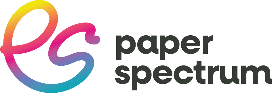
Paper Spectrum Logo Design
I recently undertook a rebranding project for Paper Spectrum based in Leicester. In the dynamic landscape of the creative print industry, the brand identity of a company is not just a logo but a reflection of its evolution, ethos, and the promise it holds for its customers.
The new branding in use at the Photography and Video Show 2024, NEC Birmingham.
The project marked a pivotal moment in the company’s journey as it merged with Dupli, setting the stage for an ambitious rebranding to align with modern demands while cherishing its rich heritage. The rebranding of Paper Spectrum underlines the critical role of brand identity in an evolving market. By embracing change while honouring its roots, Paper Spectrum set a benchmark for adaptive branding in the creative print industry.
Thoughtful design and strategic implementation can revitalise a brand, ensuring it remains relevant and resonant in an ever-changing landscape. As Paper Spectrum embarks on this artistic adventure, its reimagined brand identity stands to show the power of transformation and the timeless value of real, responsible connections with its community.
Final Logo - Cut-down Social Media Profile Version
The Challenge
Paper Spectrum, with a legacy spanning nearly three decades, had established itself as a cornerstone in the creative print industry. Its brand, however, remained untouched since its inception in 1995, designed with a print-first approach, starkly limiting its effectiveness in the digital age. The merger with Dupli brought about an opportune moment for a revamp, necessitating a brand refresh that could resonate on digital platforms , ranging from the company’s website to social media profiles, without alienating its loyal, traditional demographic.
The core challenge was to weave a new visual identity that would serve as a bridge between the traditional values cherished by its existing clientele and the expectations of a burgeoning, younger audience. This identity needed to be versatile enough to seamlessly integrate into Paper Spectrum’s existing digital presence and a future website overhaul.
Their old logo wasn’t designed for digital use.
Approach and Solution
To address the requirements of this rebranding endeavour, the approach was rooted in strategic synergy and evolutionary design principles. Recognising the importance of maintaining continuity for existing customers while appealing to new demographics, I decided to incorporate elements from Dupli’s recently refreshed branding. This was a calculated effort to foster a sense of unity and progression within the new visual identity.
The chosen route involved the adaptation of Dupli’s typeface for Paper Spectrum’s new brand image, ensuring a cohesive and recognisable link between the two entities. The colour palette was thoughtfully expanded, drawing inspiration from Dupli’s colours to craft a spectrum that signified diversity, creativity, and vibrancy, traits synonymous with the essence of Paper Spectrum.
Several branding concepts were developed, with a particular focus on ensuring that the new design would not only transcend the limitations of print-centric branding but also thrive in digital and social media landscapes. The final selection leaned towards a design that subtly evolved from the existing branding, ensuring a sense of familiarity for loyal customers while also embracing a modern, streamlined aesthetic that speaks to newer audiences.
Final Logo - Full Version
Implementation and Impact
The rebranding was not just a cosmetic overhaul but a strategic move to realign Paper Spectrum’s identity with its evolving business model and market dynamics. The new branding is being meticulously rolled out across all digital platforms, including the company’s website, social media profiles, and online marketing materials, ensuring a consistent and engaging presence. Attention was also given to how the branding would translate into print materials, maintaining the legacy of excellence Paper Spectrum is known for.
The rebranding initiative has been instrumental in repositioning Paper Spectrum within the creative print industry, enhancing its visibility and appeal among a wider audience. By marrying elements of Dupli’s contemporary branding with Paper Spectrum’s established identity, the project succeeded in signalling a new era of innovation and growth for the company. The approach to the redesign ensured that the brand’s rich heritage was not lost but rather amplified, preparing Paper Spectrum for a future where tradition and innovation coexist harmoniously.
Earlier Concept


